Client: Hailer Oy, 2020
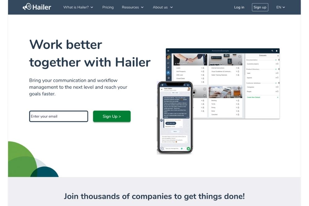
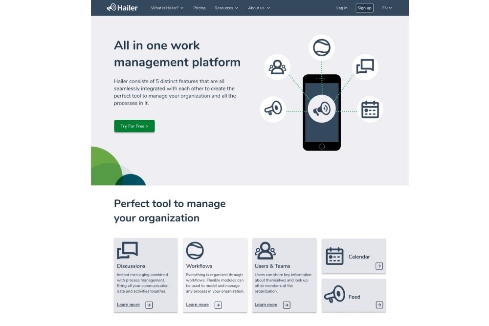
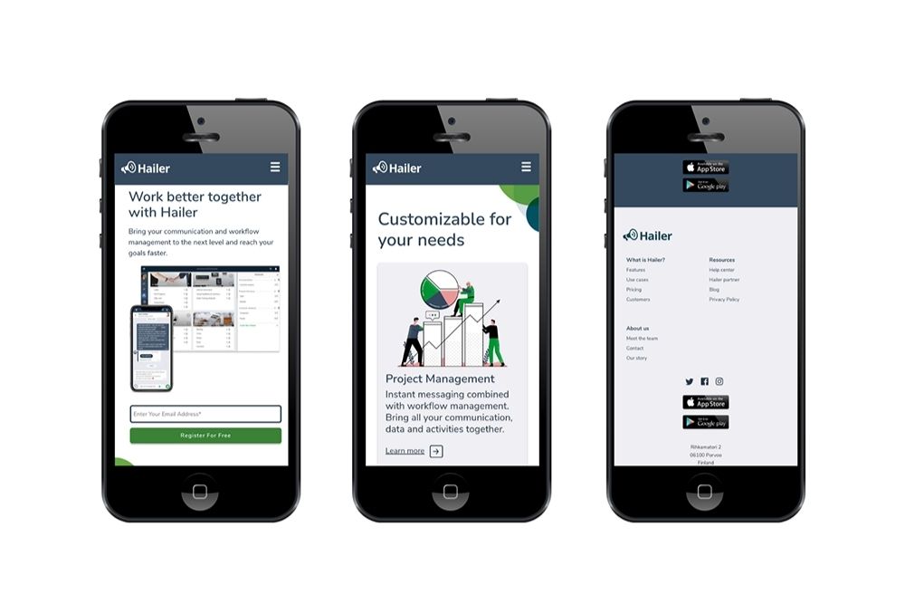
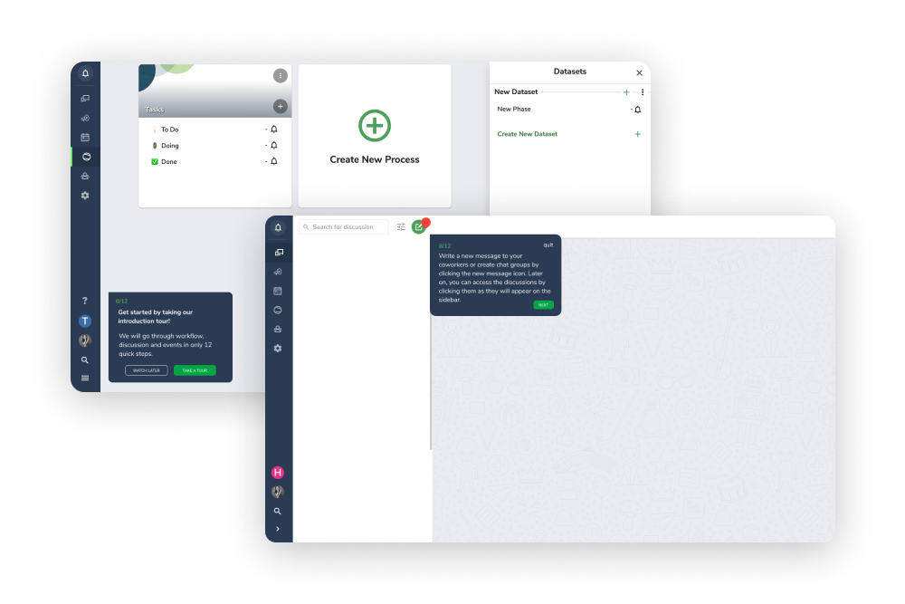
The objective for our three member team was to make Hailer’s website clearer and more user friendly. Initially, there was a lot of text on the site and it took a while to get the idea what Hailer is all about. The client also aimed to commit new and existing customers to become paying ones as many of them were using the free version of their project management tool.
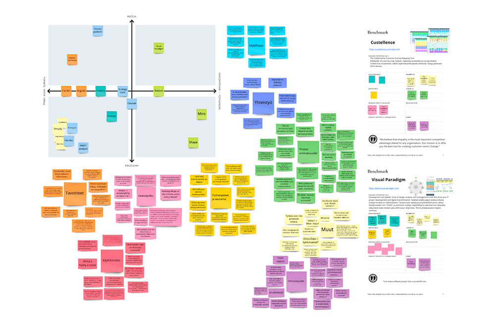
By analyzing and conducting user testing for the website we aimed to understand how people felt about the site. We also benchmarked and held a content workshop together with the client. We created reusable Hubspot components according to the company’s graphical guidelines and brand manual. During the process we also used Google Analytics, Miro, Figma and Canva tools among others.
“Collaboration was truly effective and it was easy to work with the team. We have received positive feedback from the refreshed website.”
— Varpu Jokinen, Hailer Oy
